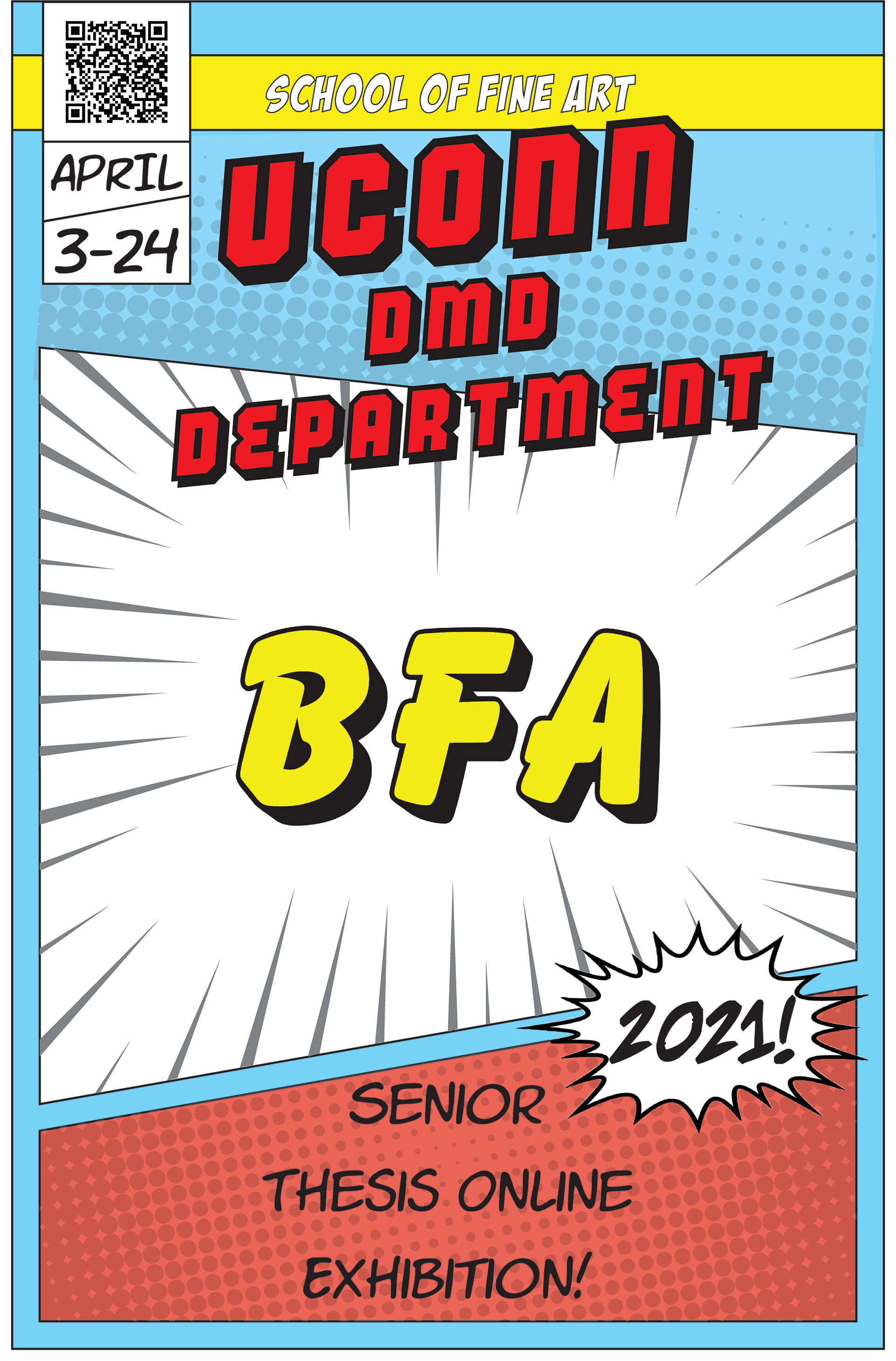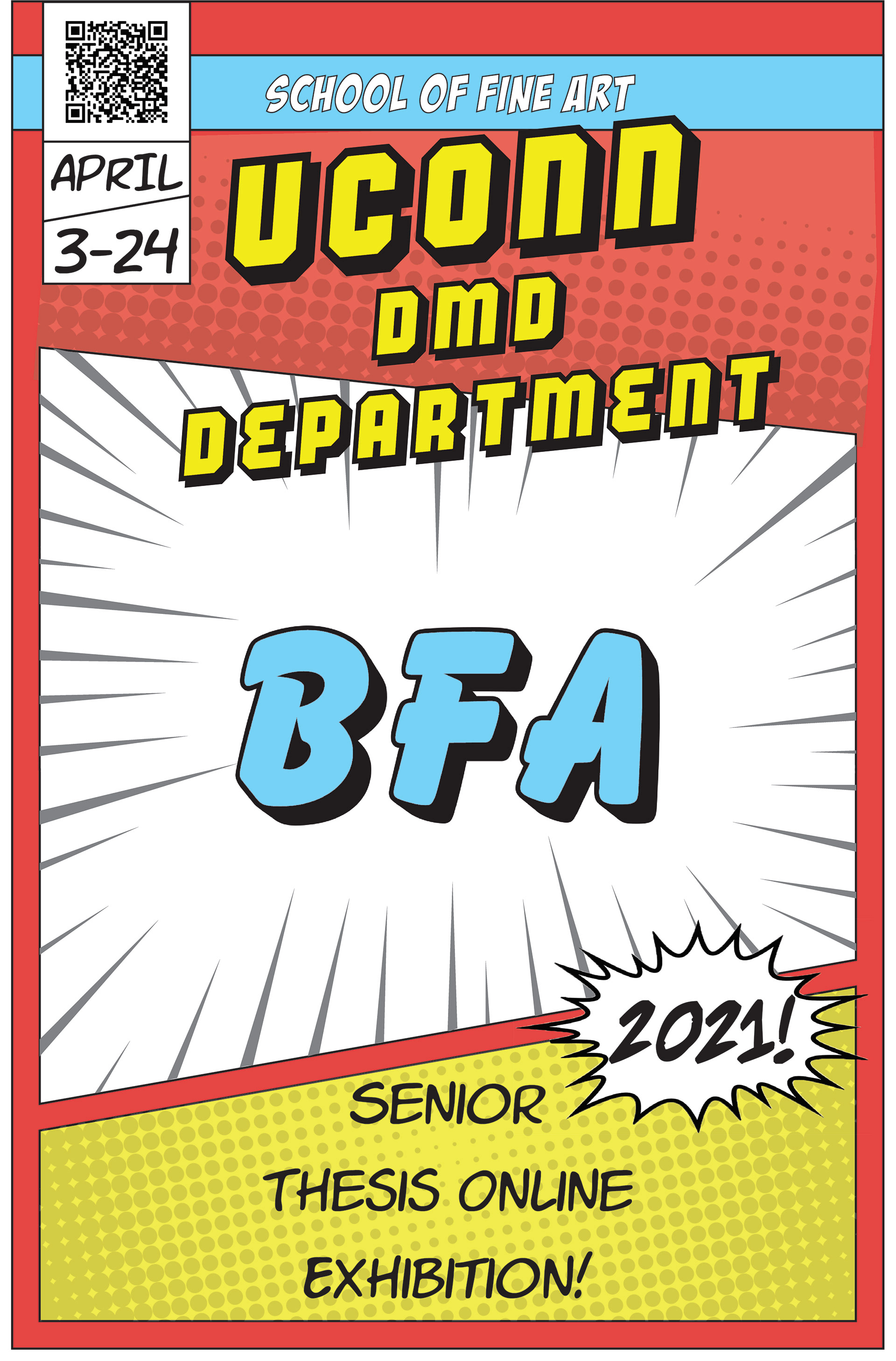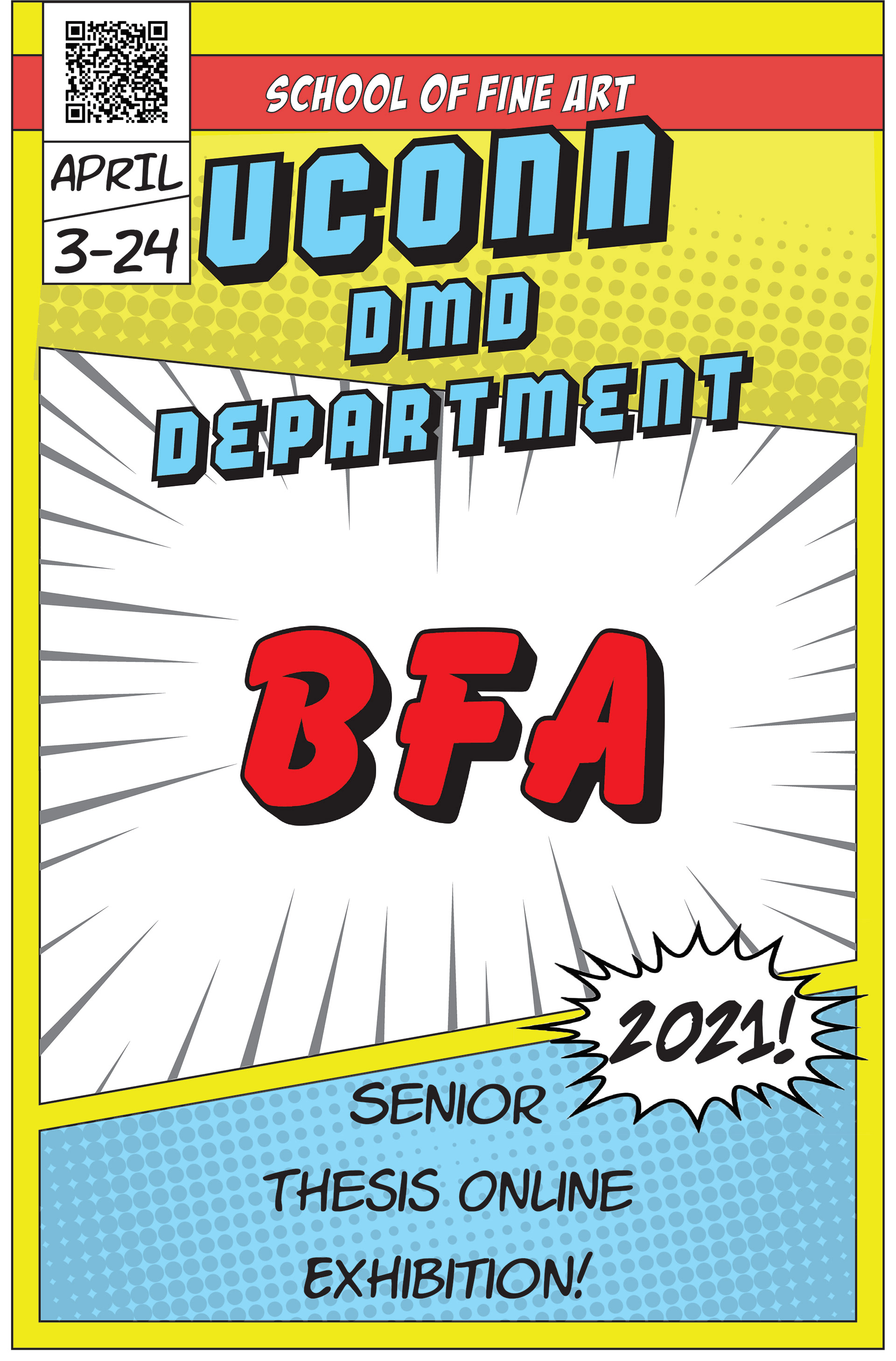


I struggled to come up with an idea for a long time, before finally getting the inspiration for a comic book cover. Once I knew what the style would be, I quickly made a rough sketch of how it could be layed out, and then remade it in Adobe Illustrator using my friend’s drawing tablet. I didn’t love that Illustrator sketch, and after a meeting with the teachers I decided I needed to do something different. I immediately got to work and sketched a new prototype, and went into Illustrator to make it. Figuring out how to make the weird angles on the trapezoids took more time than expected, but once I made all the shapes it was relatively easy after that. I messed around with a lot of different fonts before settling on six different ones for different parts of the poster. I went through a couple revisions with the placement of the QR code and some text and designs, but once I got the final version, I made the two variations and animated it. Having never used After Effects before, I struggled at first but quickly got the hang of it. I was inspired to make the “BFA” and “2021” get bigger and smaller by the way that some comic book panels or bubbles seem to pop out of the page and immerse you in the experience.